
An Odd-Shaped Space – An Architectural Designer’s Mission Impossible
Photography by Norman Allen, Provided by DGLifestyles.com
[box]One might ask, “Why the descriptive phrase an ‘odd-shaped’ space?” The featured ‘space’ coined the phrase due to the fact that during the initial phase of construction in the early 1900s, the former contractor saw it more cost effective to construct the building around a huge boulder, that to this day still rests in the middle of the foundation.[/box]
This resulted in a series of odd diagonally-shaped walls that run along the circumference of the boulder on the first-level of the building. Due to the initial building process, the first-level of the building—which is the area being renovated—has been reduced to half its actual size by a diagonal line. This divides the area of the boulder from the workable office space.

Mission Impossible
Despite the drastic reduction in a workable office area—primarily due to the huge boulder projecting into the building—our client highlighted their ambitious appeal for:
– Three closed offices for lawyers
– A file and data room
– A conference room for eight
– A lobby area and a reception
The initial request was then shortly followed by an extra wish: “…and by some stretch of the imagination, please try to squeeze in an additional area for two secretaries.” Astonishing – this would be a challenging feat and for a moment, my jaw dropping reaction showed signs of disbelief at my client’s request.

Structural Solution
Based on the workable space, it seemed like ‘Mission Impossible,’ or was it?
As my ‘Ethan Hunt’ mentality geared into action, I devised what we had to do:
(i) The standard size partition walls of 5 inches could not be used or we would quickly run out of workable office space. Based on our calculations, we had to ensure that the walls were no more than 3 inches in width to permit creation of all the divisions that our client requested.
(ii) The use of a standard swing-door was also out of the question, as the hallway was only 4 ½ feet in width, which is just a little wider than a standard office door. If standard swing-doors were used, it would be impossible for a person to walk through the hallway while an office door was open.
Additionally, having the door swinging in would be impractical, as it would drastically reduce the workable space in the enclosed private office. At the end of my assessment, a solution was eminent. By using 1 ⅝ inch structural metal tracks for the foundation and 2×4 lumber as the frame-walls, we were able to reduce our walls from 5 inches to 2.5 inches, while still maintaining the recommended structural strength in the walls.
These walls were then packed with soundproof insulation to dampen the sound travel through the already thin walls, and further covered over with gypsum board (sheet-rock) for a clean finish.
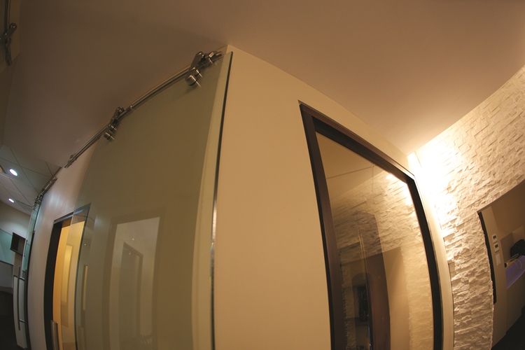
The doors were another resourceful and stylish idea. By eliminating swing type doors and installing wall-hung chrome and frosted glass doors, we not only made the space functional, but also added the first focal-point element to the new office.

Focal Points
Amidst the stunning wall-hung doors, there was yet another focal point that came into play. Due to the challenge of a small workable area, we had to create a break in the monotonous flow of the walls. If we ignored this element, we would produce a claustrophobic effect and further diminish the possibility of harnessing a positive, breathable, inspiring environment required in an office.
In achieving this transformation, we looked to the irregular distorted visual-effect created by the installation of stack-stone walls. We also found that the white stack-stone walls visually magnified the entire space where it was used.
With this in mind we ran the stack-stone walls along the entire perimeter of the reception area and further down to the lobby. This tactic gave the illusion that both units were merged into one larger unit, hence creating a more open space.
This visual stratagem of opening the space also has a psychological effect of creating a more breathable work environment, conducive to productivity while simultaneously adding character to the unit.

Lighting
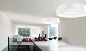
When working with small-spaces, it is important to avoid using ‘directlighting’, as this will just give the visual effect that the space is even smaller than its actual size.

Based on this knowledge, we ensured that all our recessed lights ran along the perimeter walls and were adjusted to focus outward onto the stack-stone walls. This produced the effect of ‘indirect reflective lighting’ – a tactic that visually expands the size of small rooms to appear larger than their actual size.
The tan coloured walls and white stacked-stones also enhanced the reflection of the ‘indirect-lighting’ technique, which worked perfect in visually opening the space.
In the architectural world, an odd shaped room can appear deceiving, but with the right vision and design techniques, that room can be transformed into a unique, classic work of art.
[ts_fab]